News
How to use marsala; Pantone’s 2015 colour of the year

May
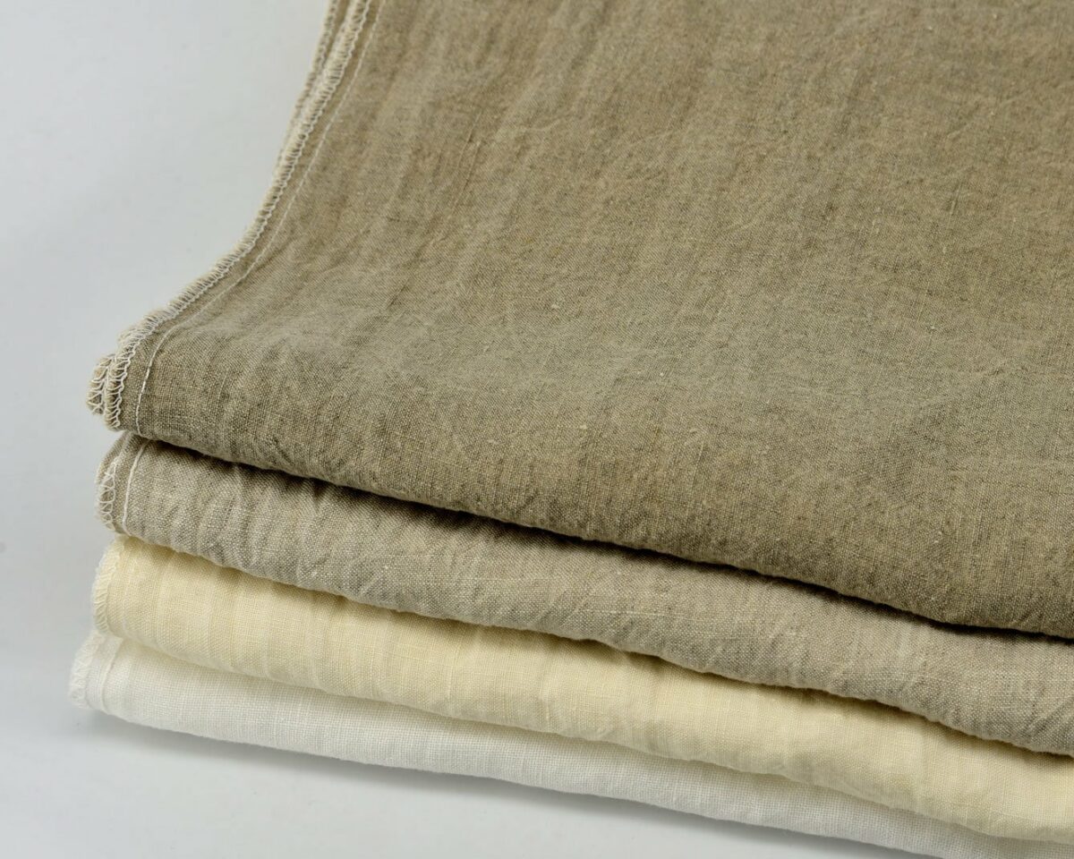
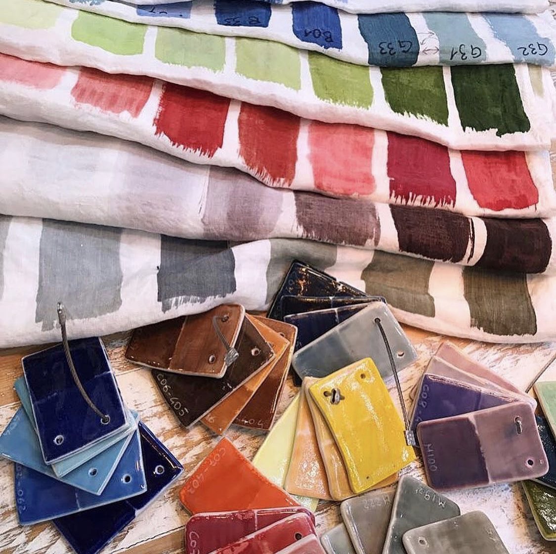
Every year, Pantone announces the colour of the year. Here’s how to use marsala; Pantone’s 2015 colour of the year, a deliciously rich and warm red wine colour which blends well with turquoise, pale blue colour hues, greenish blues and light pastels.
The beauty of decorating with this colour is that it works like a style chameleon which can be adapted to complement almost any home décor style or character.
For a warm and homely feel, Marsala works particularly well with glass, bronze, orange and gold accessories.


For a more artistic and eccentric effect, Marsala contrasts beautifully with turquoise.

Rather than redecorate completely to incorporate the Marsala colour theme, you can simply add a few carefully-selected accessories to implement the look.
If you already have neutral décor in the room you would like to update, you have the ideal blank canvas to work with, and can pull off the Marsala look whilst spending less than £100 per room.
For example, you can add the Marsala look to your living room by purchasing some candles, a feature light and even a Marsala feature wall.


For the more artistic and dramatic look, add turquoise candle holders, flowers and art work.