News
Interior design trends for winter 2015

Dec
As the weather turns colder and we withdraw into our homes, surrounding ourselves with stylish yet cosy interior design feels more inviting than ever.
Winter tones
Winter weather, at its best, covers a palette of soft greys, crisp whites and pearlescent shades, and this year’s winter trends follow suit. Bedrooms and lounge areas are draped in ash grey coverlets, off-white fluffy pillowcases, and dark slate woollen rugs.
The dove grey Elisse quilt we have hand-selected from artisans Stamperia Bertozzi echoes this trend perfectly. Hand stitched and created from the finest Italian bed linen, the muted colour and endearing imperfections of its finish reflect the winter atmosphere we would love to have.

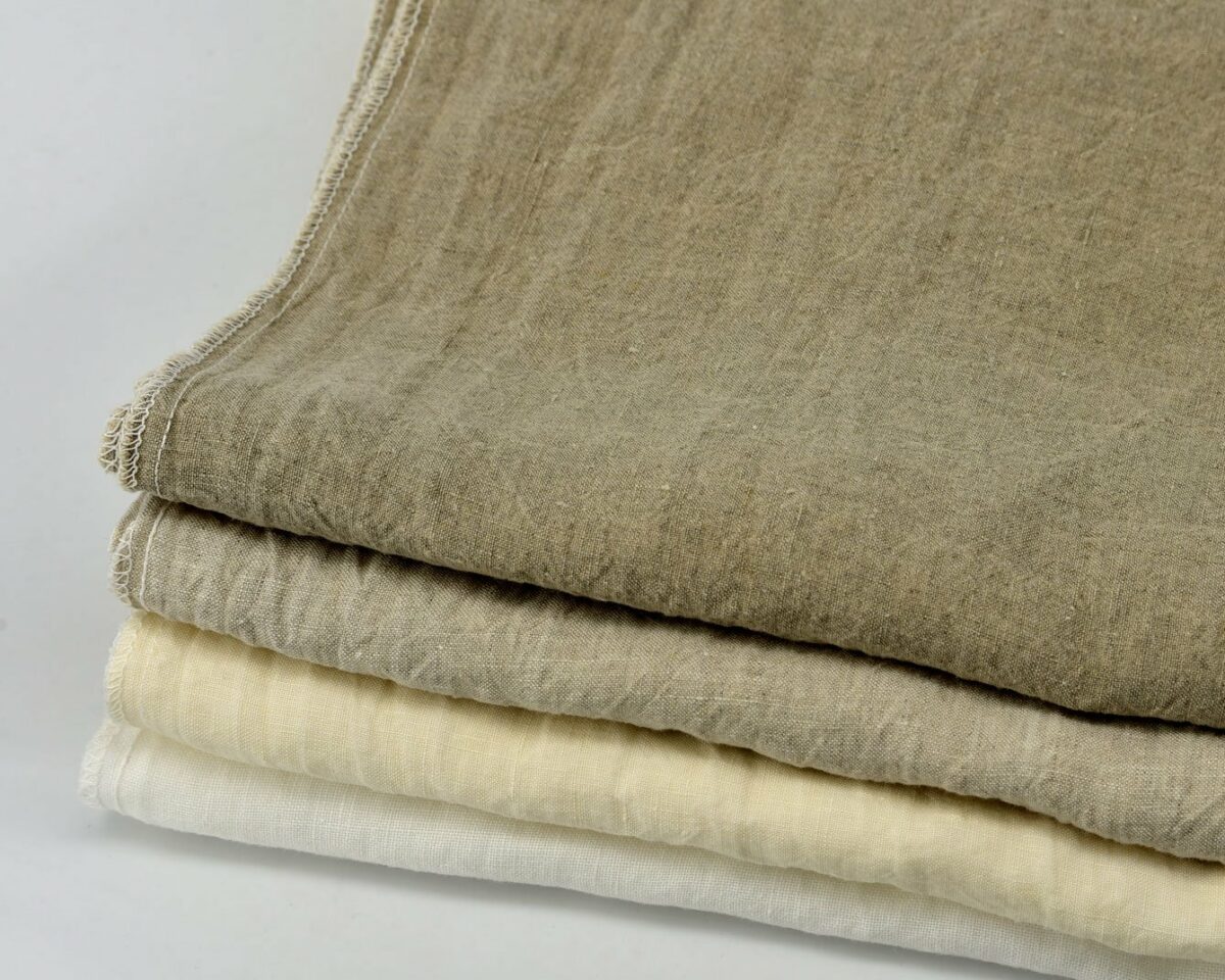
Focus on fabrics
Just as “organic” has become the by-word for foodies, interior design lovers are focusing on high quality, natural fabrics for winter. Beautiful wools, soft to the touch linens, and luxe cashmeres are the materials of choice for home decoration, particularly across homeware. Tactile textiles are the new winter accessory for your home, and they’re particularly suitable for Christmas parties and cosy gatherings during the cold season.
We recommend a beautiful layout of luxury table linens worthy of an editorial shot and replete with warm-toned hues, accentuated by wine aplenty and gorgeous ceramics. Our 100% natural crumpled linen, hand-printed in vintage styles, are innately high quality and certain to draw admiring glances.

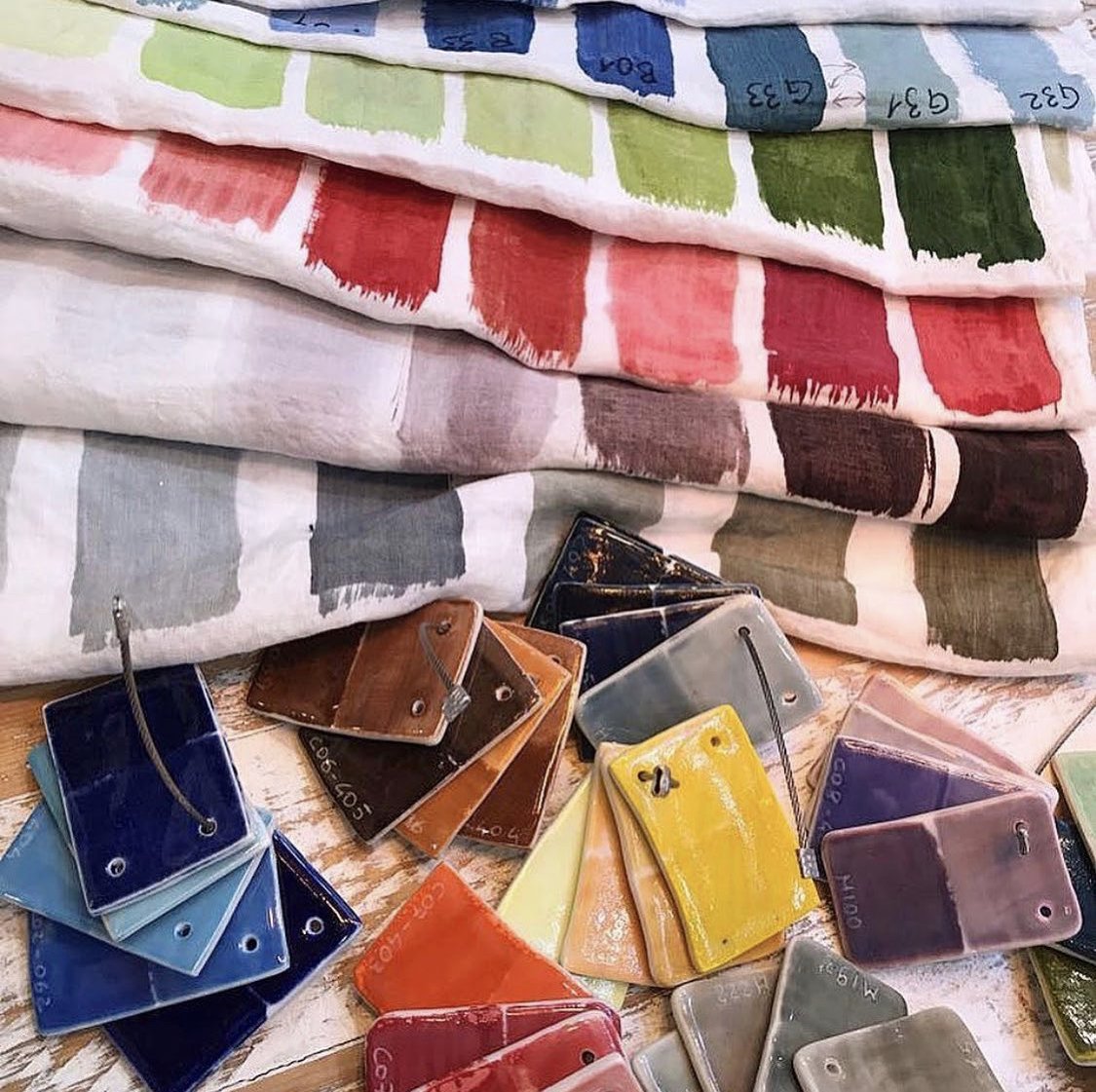
A bright splash of gold
To keep the dark tones of winter from becoming too overwhelming, interior design aficionados are taking their inspiration from the golden hues of summer. Charcoal grey walls and furniture are brightened by a sun-soaked splash of gold to sustain a liveliness in winter décor. Whether utilising this precious metal in the form of light fixtures and figures or soft furnishings such as cushions, throws and rugs, this sunnier colour balances wintry hues that fall into a colder palette.
Our personal approach is simple. A focal point of colour – such as the hand-painted cushion cover in graduation yellow from our collection – draws the eye and warms cool undertones. Casually place one of these in a room in need of a lighter touch and the effect will be instantaneous.
