News
Muted Tones – Creating The Look At Home
Jan
Welcome back to our blog and our first post for 2021. With a firm, winter chill still in the air we look to the outdoors and this cold season to inspire our home décor. Muted colours (think beiges, creams and greys) can be seen on the frost covered ground, within the darker, greyer skies and across nature. Rather than seeing this time of year as gloomy or drab, these softened shades can be celebrated and employed to create a fabulous and warming scheme.
Base Colours
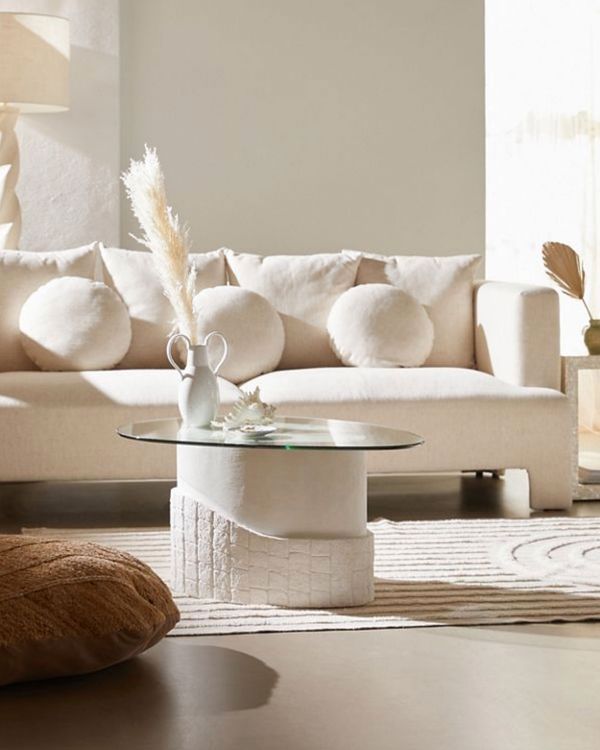
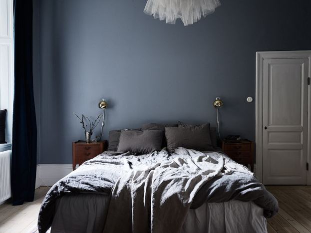
Connected to calmness, lighter palettes can create a welcoming restful haven in your home; perfect for unwinding and relaxing following on from the stresses of the day. Creating a sanctuary within your home may, at first, seem daunting but working out the initial base colour for the room or décor is a simple start that can quickly develop into a plethora of ideas leading to the final design. A great base really sets the scene and grounds the entire look of the space that you are creating. Both classic and contemporary, white is one of the most versatile and pliable of bases – a literal blank canvas for ideas. Likewise, toning down white, we move into creams and rich, light khakis that add slightly more depth. Depending on which room you are designing, you may want to consider pastel colours. Powdered finishes add to a sense of tranquillity and allow for the use of bolder colours that, sometimes, can look rather overwhelming (dark blues, yellows, greens) but are tempered through a powdered finish.
Colour Combining
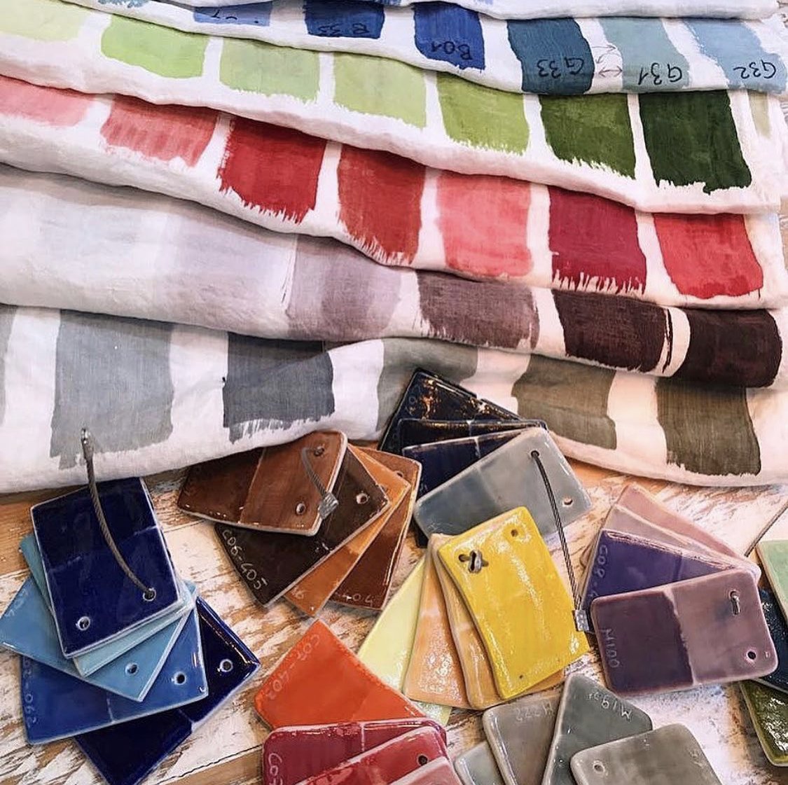
Muted interior schemes truly allow for a fabulous array of combinations. Whether creating a chic look through a similar range of neutral tones or adding counterpoints through brighter splashes of colour, you can really play and have fun. We would suggest, if you are to add brighter hues, that you complement with various shades of the same colour. Combining earthy tones makes for a modern yet timeless look regardless of the room and can be expanded across your home.
Credit: Coco Lapine Design
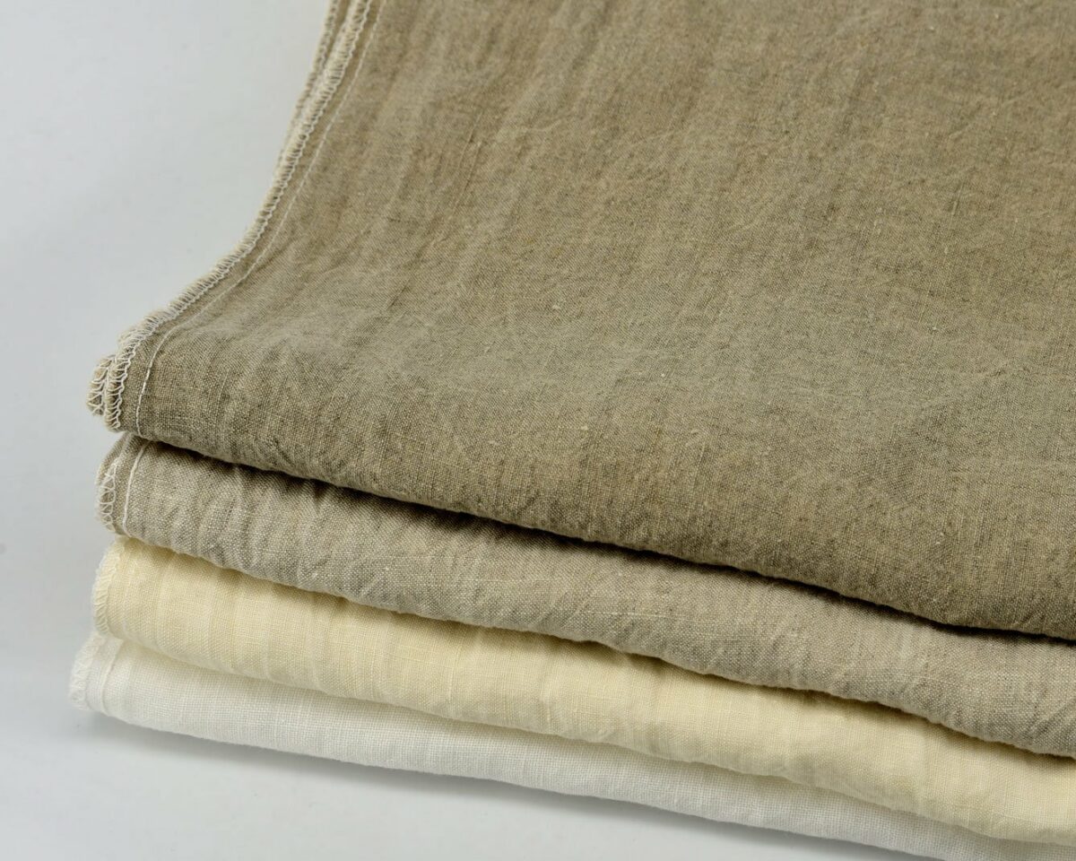
Adding Counterpoints – Textural & Tonal
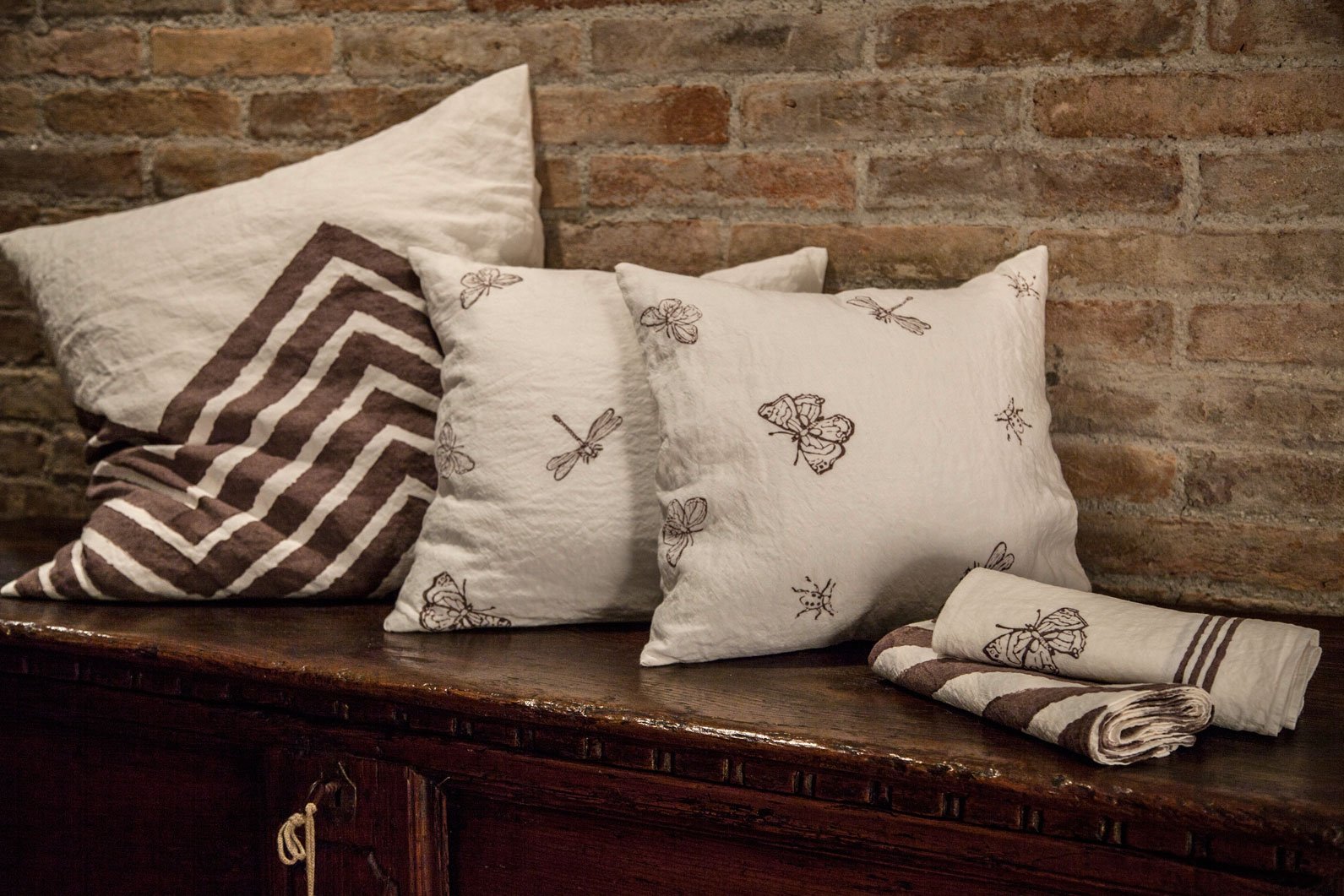
Often neutral and muted tones bring a cleanness and sharpness to a space which can sometimes be ever so slightly cold. Creating textual and tonal points can help to alleviate this coldness and natural materials bring with them a sense of texture that is perfect to help build out a warmer feel. Our natural, luxury linen bedding, with its delicate yet bright hues, make an ideal addition to a cooler bedroom décor.
![]()
Hand-painted and block-printed bedding Chevron
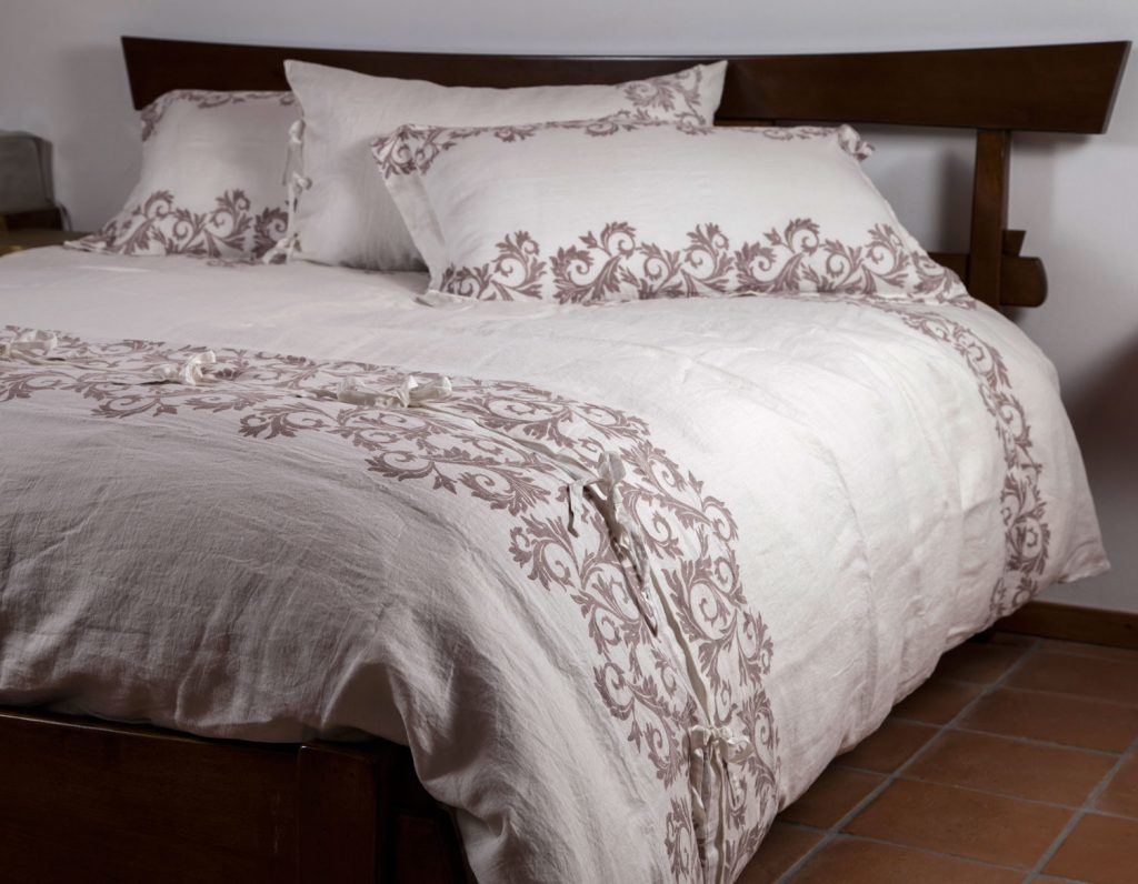
Block-printed bedding Acanthus Leaves
A Complete Change?
Adding muted shades and influences to your home doesn’t have to involve the painting of walls or buying new furniture. The introduction of new items of décor, whilst at first may not seem a huge change, can gradually begin to shape an existing style. Smaller styling pieces and decorative accessories can help to reinforce the palette which you are trying to achieve.
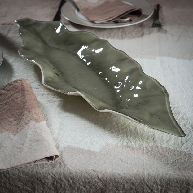
Handmade Glass Dish – Foglia Taupe
We hope you have enjoyed our advice on how to style you home with muted colours. Keep up-to-date with our latest items and content by subscribing to our newsletter with a simple click on the sign up button at the bottom below.
(Main image credit: The Cut)